Improving visibility of features for a leading SaaS startup, boosting conversions by 125%.

I was a Product Design Intern at Pendo, a rapidly-growing startup offering a suite of tools that help businesses understand what drives their success. One of Pendo's key products is Guides, which businesses can deploy to fulfill a number of purposes - onboarding new users, announcing new features, and communicating important updates to their product. During my internship...
I explored ways to reduce customer frustrations.
I focused on increasing customer awareness of promising new features.
I immersed myself in every part of the design process.
I participated in research sessions, collaborated with designers and developers, and produced deliverables in Figma and Whimsical.
I boosted conversions for a new feature by 125%.
I presented my work to the company, and saw my ideas making a positive impact in the product.
First Project
Guide Details with Repeat Guide Display
Boosting visibility for a new feature while optimizing a pre-existing design.
Background
Repeat Guide Display (RGD) was a new feature that allowed Pendo customers to set a guide to repeat a certain number of times and expire after someone dismisses it a certain number of times.
This feature was created as part of a broader initiative to give guide administrators more control over how their guides activate. By allowing a guide to display based on customer behavior, administrators can worry less about their customers being "spammed" with unnecessary guides, and have a better understanding of what guides work best for their business.
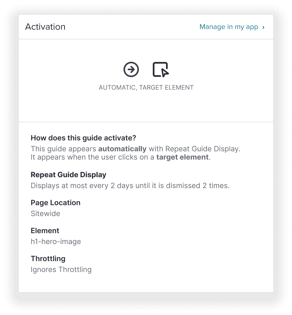
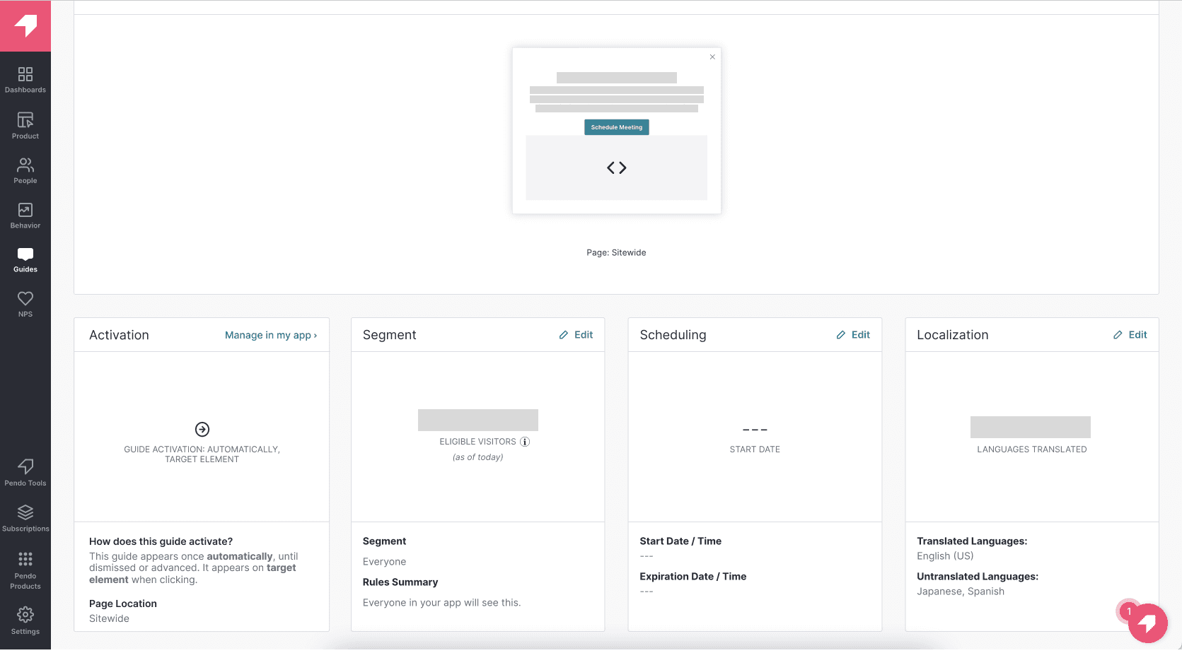
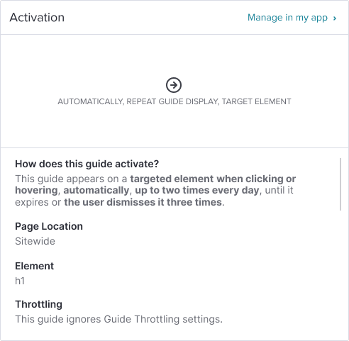
When a user wants to see how one of their guides is working, they can access the Guide Details page, which functions like a dashboard. The Activation card, located at the bottom left of the dashboard, provides a quick overview of how a guide activates.
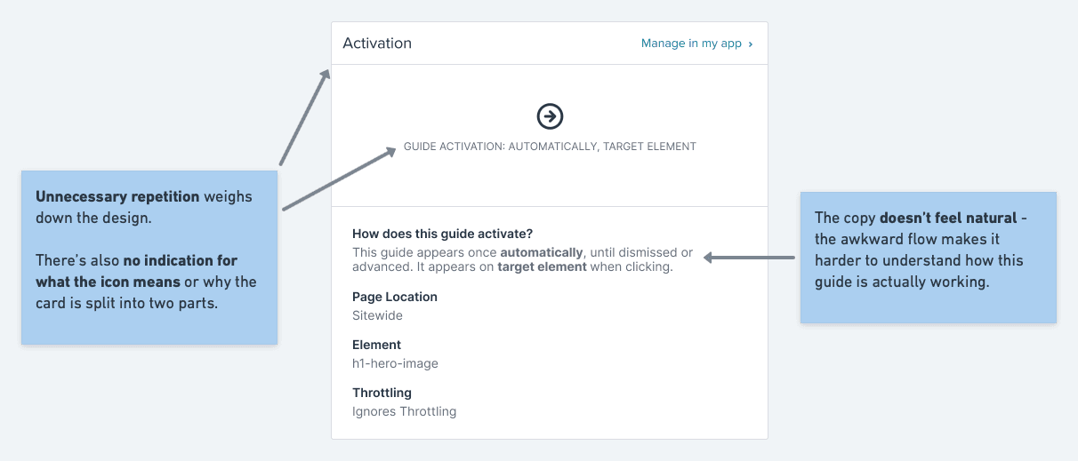
There was no way to tell if Repeat Guide Display was activated on the dashboard.
The excitement of Repeat Guide Display was hampered by these issues, leading to me looking into ways to incorporate this important information into a redesigned Activation card.
Design Process
One of the biggest concerns when approaching this design was the time constraints. RGD was already in the product, so I started by prioritizing simple fixes that would be easy to implement.
First Iteration
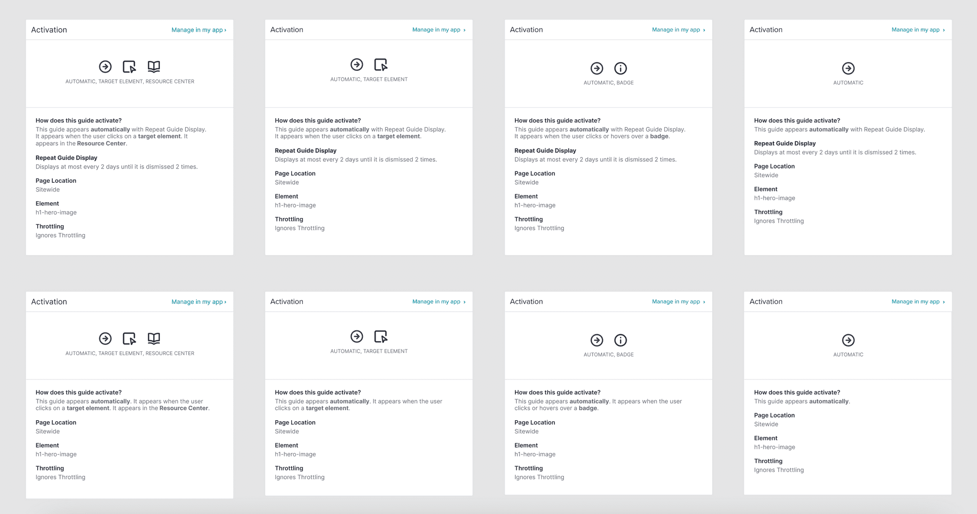
At first, I looked into how to incorporate the details under the "How does this guide activate?" heading.
This was a straightforward option, but it started to fall apart when it came to testing edge cases.
For example, when more than 2 activation types are used in the same guide, the sentence grows to be too long and complex for users to understand at-a-glance.
With this in mind, I looked at the bottom half of the card to see how I could reorganize the information in a way that's easier to scan.
Second Iteration
My next iteration focused on parsing the information into smaller fragments with corresponding icons.
While this improved readability and gave Repeat Guide Display a dedicated field, it would've been more intensive to develop.
Additionally, feedback from users showed that they appreciated the sentence-based explanation of the guide's behavior.
After exploring these options, I realized that I needed to design a middle ground between these two options. The design needed to reduce reliance on text by using visual cues, without impacting how the information was being presented.
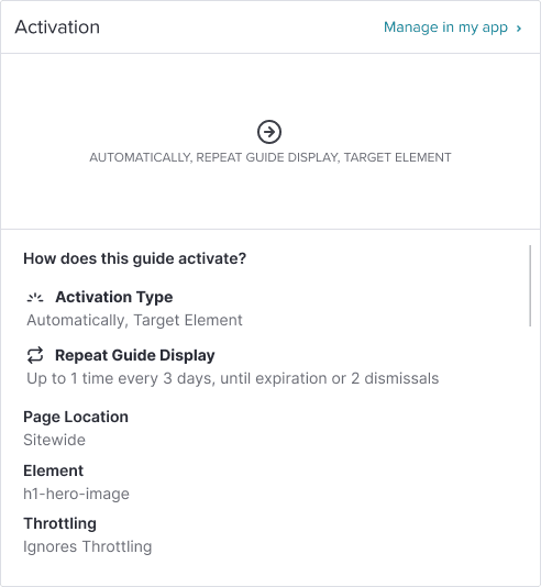
Solution
For the final design, I added icons correlating to each activation type that appear in the top of the card when each type is selected, giving users a way to visually identify how their card is being activated beyond text.
I also reworked the copy for “How does this guide activate?” and “Repeat Guide Display,” to convey the information in a natural, consistent manner.
Outcomes
With the support of my team, I took this project from ideation to development in only a few weeks. It was launched in mid-July.
Two months later, the design team ran a funnel analysis on the new design, testing for a change in clicks on a guide's Repeat Guide Display settings after viewing and clicking on the new Activation card.
Customer use of Repeat Guide Display from the new dashboard design increased by 125%.
By adding visibility for the feature outside of the designer, customers are seeing increased value for the feature and finding more uses for it in their guides. I'm happy to see my work bringing users closer to a powerful new feature, and hope this trend continues!
Second Project
Adding Categories to Saved Layouts
Adding flexibility to a promising new feature.

Background
After completing my first project, I wanted to dive deeper into the need for efficient guide management demonstrated by Pendo's customers. Research uncovered concerns from customers about overwhelming their users with guides, prompting some to limit their active guides.
Recognizing this, my team proposed adding categories to guides to give customers more control and smarter guide management. Each category would have predefined rules to add guardrails for what goes in a particular guide.
When creating guides, customers are able to save the visual and stylistic elements as a layout. With a layout, it takes far less time to create a new guide - customers can select the layout to streamline the addition of new guides. However, some issues emerged.
Layouts were identifiable by name only.
There were no other ways for a user to differentiate between layouts.
There was no way to sort or filter between layouts.
Depending on the customer, this could lead to very long lists of layouts.
Customers cannot edit a saved layout.
To make changes, they have to make a duplicate and delete the original.
Customers had no way to properly organize and manage their layouts.
These limitations substantially lowered the feature’s usability. The team and I decided that adding the ability to categorize layouts would be a foundational step towards improving this feature and broadening the capabilities ofr guide categorization.
Design Process
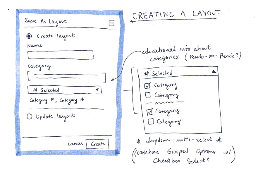
When starting this project, I recognized that a dropdown should be an integral part of the solution. This choice made sense because dropdowns were already used throughout Pendo's product ecosystem, including in existing Guides features.
I started sketching out low-fidelity wireframes, varying in complexity, and ultimately landed on the following idea:
The interface features a new field for adding categories with helpful explanatory text. A multi-select dropdown enables users to efficiently assign one or more categories to their layout in a single interaction.
While collaborating with another designer on the team, we discussed adding the ability to update existing layouts with these new categories. However, to keep the project manageable within our tight timeline, we decided to focus solely on adding categories.
I used Whimsical to create wireframes that expanded on this design.
Prototyping
As I started prototyping the design in Figma, I explored the different dropdown variants in the Pendo design system.
First Option
Initially, I opted for a checkbox-based dropdown used in different parts of Engage, Pendo's main product.
This dropdown organizes options with headers for clarity and categorization. When a user picks a category, it moves to a "Selected" section, allowing users to easily view and remove selected categories.
However, when a category moves to the "Selected" section, it loses the context for various use cases provided by the headings in the list.

Second Option
I then tested out a dropdown with pill-shaped tags, also found throughout Engage. Unlike the first dropdown, selected options stay highlighted in their original position on the list of categories.
When gathering feedback from my team, we realized that the absence of checkboxes might make users unaware that they can choose multiple categories. Before a user selects anything, this dropdown appears identical to the single-select dropdown in Pendo’s design system.
To address this, I chose to combine the styles of both dropdowns into a custom component.

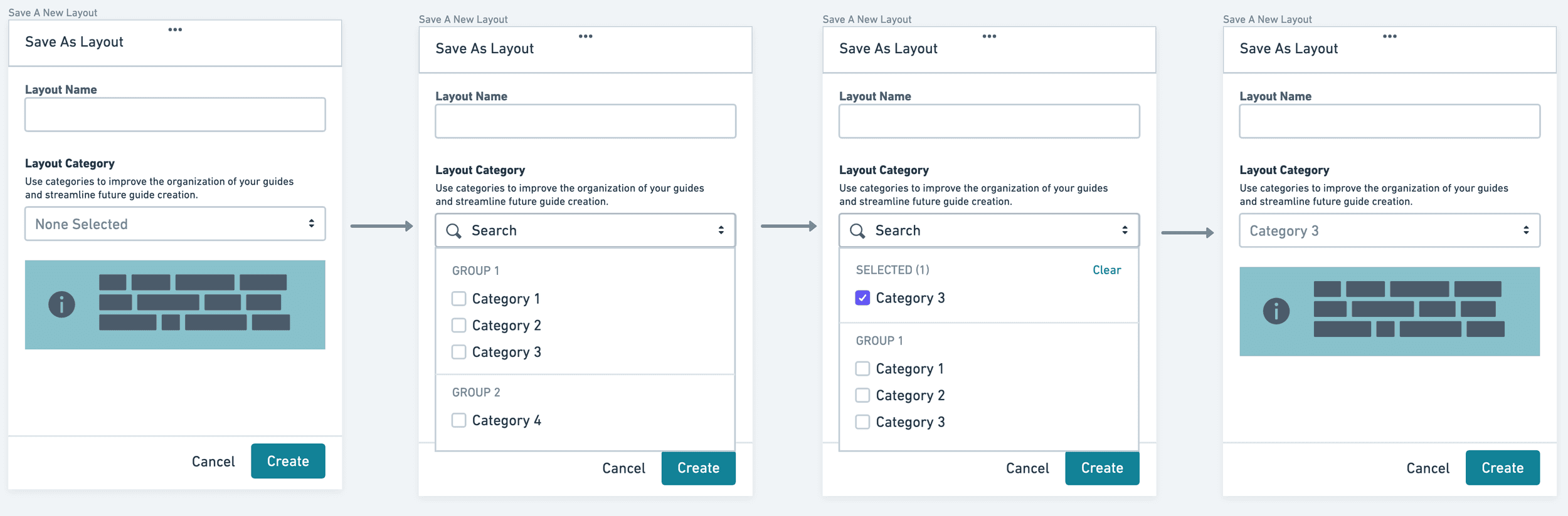
Solution
The final design combines the simplicity of the checkboxes in the first option with the added visibility of the “tags” in the second option.
When users select a category, it is highlighted in the dropdown list, appears in a dedicated "Selected section with a bulk clear option, and remains visible as a "tag" in the field when the dropdown is closed.
This approach provides clear visual confirmation of selections while maintaining context throughout the interaction.
For situations where multiple selections exceed the available space, I implemented a numerical truncation system that displays visible categories while indicating the total number selected.

Outcomes
As my internship came to a close, I handed off my design to the engineering team for development. I advocated for my design decisions and emphasized the feature’s value to customers, while collaborating closely with engineers to ensure accurate implementation of all design elements. At the time of writing, it was still in development.
While quantitative data for the new feature is pending, I’m confident that it will significantly improve how Pendo’s customers organize layouts and create guides. The structured categorization system should reduce a lot of friction in managing complex guides and improve workflows.
Takeaways
My internship was such a valuable experience. We’d be here for a while if I listed everything I learned, but here were my key takeaways:
Feedback is instrumental.
One of the things I loved the most about the design team was the weekly huddles to go over our work and gather feedback from teammates both inside and outside of whatever product space you were working on.
It's hard to even quantify how much I benefitted from these meetings, and opening myself up to feedback (including the brutally honest feedback) led to some game-changing epiphanies for myself and my designs.
Organize everything.
By keeping my Figma files tidy and tracking meetings and iterations in my Notion workspace, I was able to speed up communications, deliver an airtight presentation of my work, and preserve my sanity.
Do nothing without intention.
I knew going into the internship that I wanted to ship at least one project - and that was daunting. It was even more daunting when I realized there was so much I didn't know about the product space, and I had less than two months to get everything done.
Keeping my goal at the forefront of my mind allowed me to stay motivated and hand off two projects to development.