Creating an accessible podcast player for hard-of-hearing individuals.
As the final project for a design class I took in college, I designed WaveForm, an accessible podcast player for hard-of-hearing individuals. With live captions, transcripts, and fine-tuned audio adjustments, listeners can tailor their experience to their unique needs.
Background
There’s a huge gap in accessibility within the world of podcasting.
Resources for individuals with hearing impairments or issues with auditory processing are surprisingly scarce . Even basic accommodations like transcripts are rarely available, and mainstream platforms such as Spotify and Apple Podcasts lack integrated support for these resources, forcing users to search elsewhere. Inconsistent audio levels across podcasts add another barrier for the hard-of-hearing.
For my final design project at UNC in Fall 2021, I set out to create a solution that would make podcasting more inclusive and enhance the listening experience for those underrepresented audiences.
Research
I dug deeper into these issues with user research.
I facilitated listening sessions with three UNC students representing different user needs. Among them were two students with ADHD—one who regularly consumed podcasts and another who struggled with audio-only formats.
I employed an in-depth conversational interview approach to maximize insights within my limited timeframe. I then synthesized the data into two distinct user personas to guide my design process.
My research confirmed that my concerns about podcast accessibility reflected a broad set of unmet needs. The barriers were preventing entire communities from fully experiencing the educational and entertainment value of podcasts.
Ideating + Wireframing
I began sketching out my ideas.
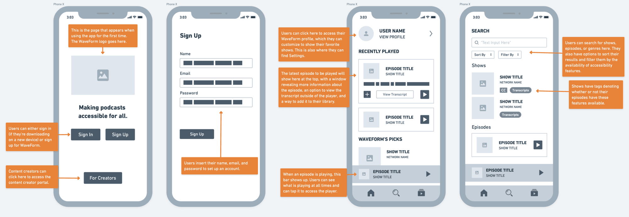
I then developed digital wireframes using Whimsical. While incorporating familiar patterns and components from industry leaders like Spotify and Apple Podcasts, I differentiated WaveForm through purpose-built accessibility features, like accessibility-focused search tags and live captions within the player interface.
Prototyping
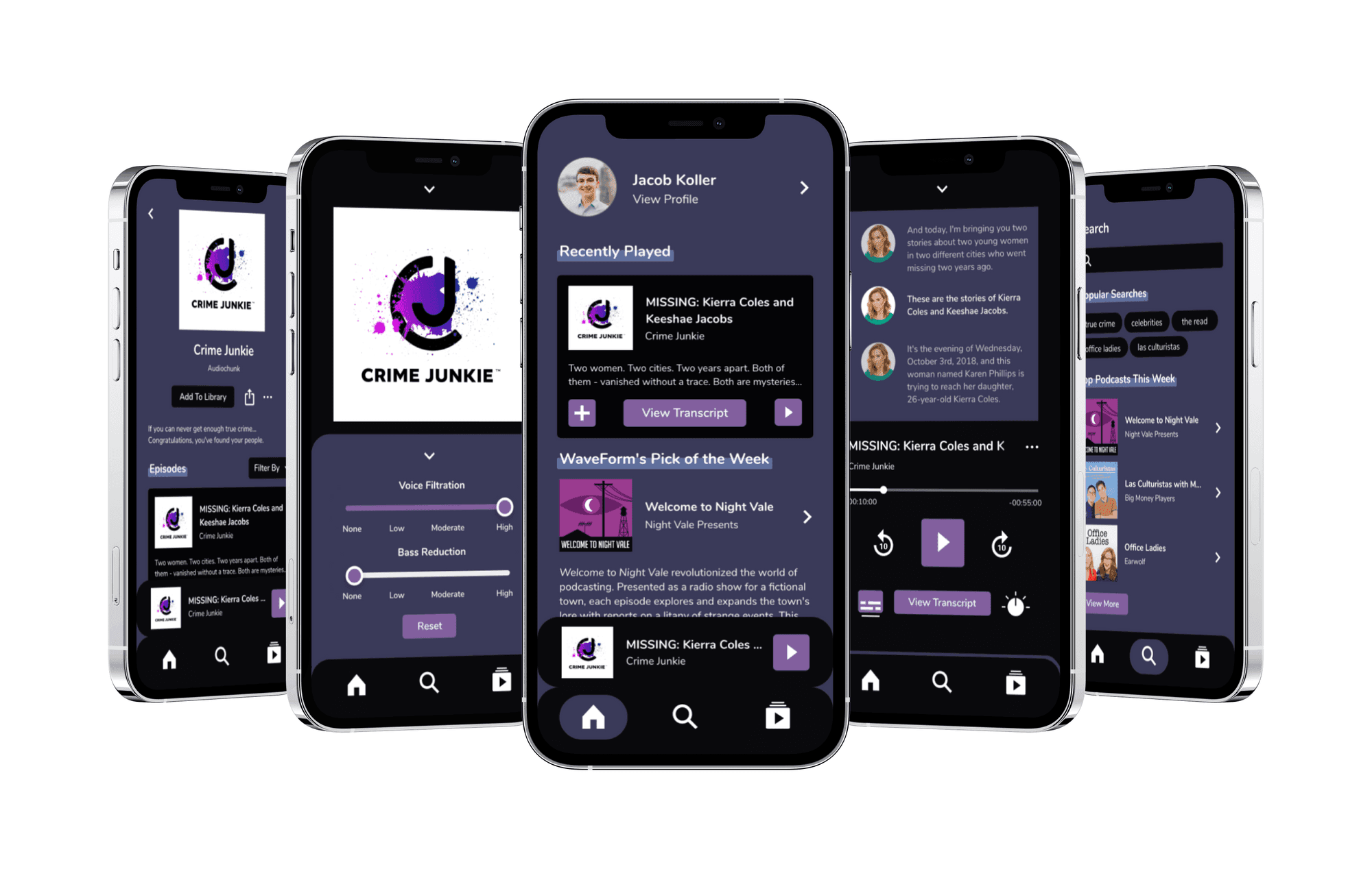
I used these wireframes as the framework for my first prototype, giving the app a cohesive and accessible identity.

Testing + Iterating
I tested the prototype with three users on UserTesting.com.
All testers appreciated WaveForm's core concept. One tester said they would "definitely use this if it was real," demonstrating the potential market value. Two users appreciated the "simplicity" and "eye-catching" quality of the design, though one participant characterized it as "a bit gloomy" and not engaging enough.
The accessibility-focused features—particularly the live captions and integrated transcripts—received unanimous positive feedback. Two participants completed all their tasks seamlessly. One user, however, encountered a navigation dead-end after taking an alternative path through the first task, exposing an oversight in my prototyping.
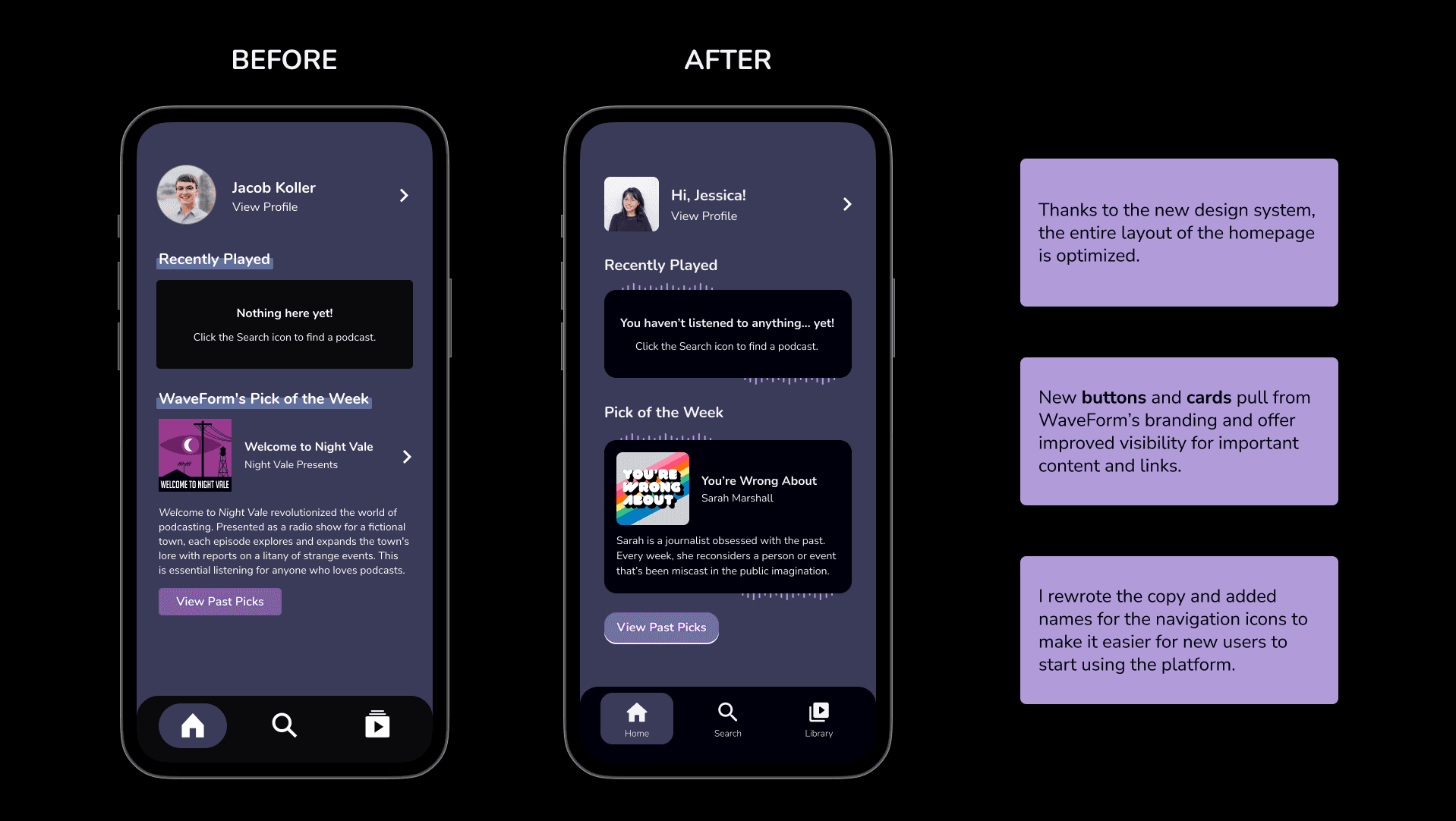
This feedback guided me towards two areas for improvement: mapping all potential user paths and interaction points in the prototype, and refreshing the visual design to create a more vibrant, consistent experience while maintaining the app's accessibility-first approach.
Revised Prototype
With their feedback, I revised the prototype.
The revised design addressed user feedback, improving connections throughout the app and introducing vibrant visual accents to various parts of the interface.
I also expanded the product vision by developing a 'Creators' section, establishing a framework for podcasters and networks to produce more accessible content directly within the ecosystem.
One Year Later...
Background
Turning a setback into an opportunity.
One day, while working on my portfolio, I discovered that the original project files were corrupted and no longer accessible. But I saw this as an opportunity to revisit one of my favorite projects with fresh eyes.
In the year since creating the initial design, I had deepened my understanding of inclusive design and advanced my Figma skills. So, I embraced the chance to give WaveForm a much-needed refresh.
Design process
Back to the drawing board.
I started by setting goals that I wanted to achieve with this redesign, rather than diving headfirst into replicating the original layouts.
Goal #1
Audit the original design’s accessibility.
This meant more than simply double-checking color contrast levels. I wanted to see how the original features I had designed for WaveForm had held up over time, and adjust accordingly to improve the app's usability.
Goal #2
Use a component library.
I'd been learning more about design systems, and saw this as the perfect opportunity to create and apply elements of a design system. This was aided by the flexibility of Figma's component libraries.
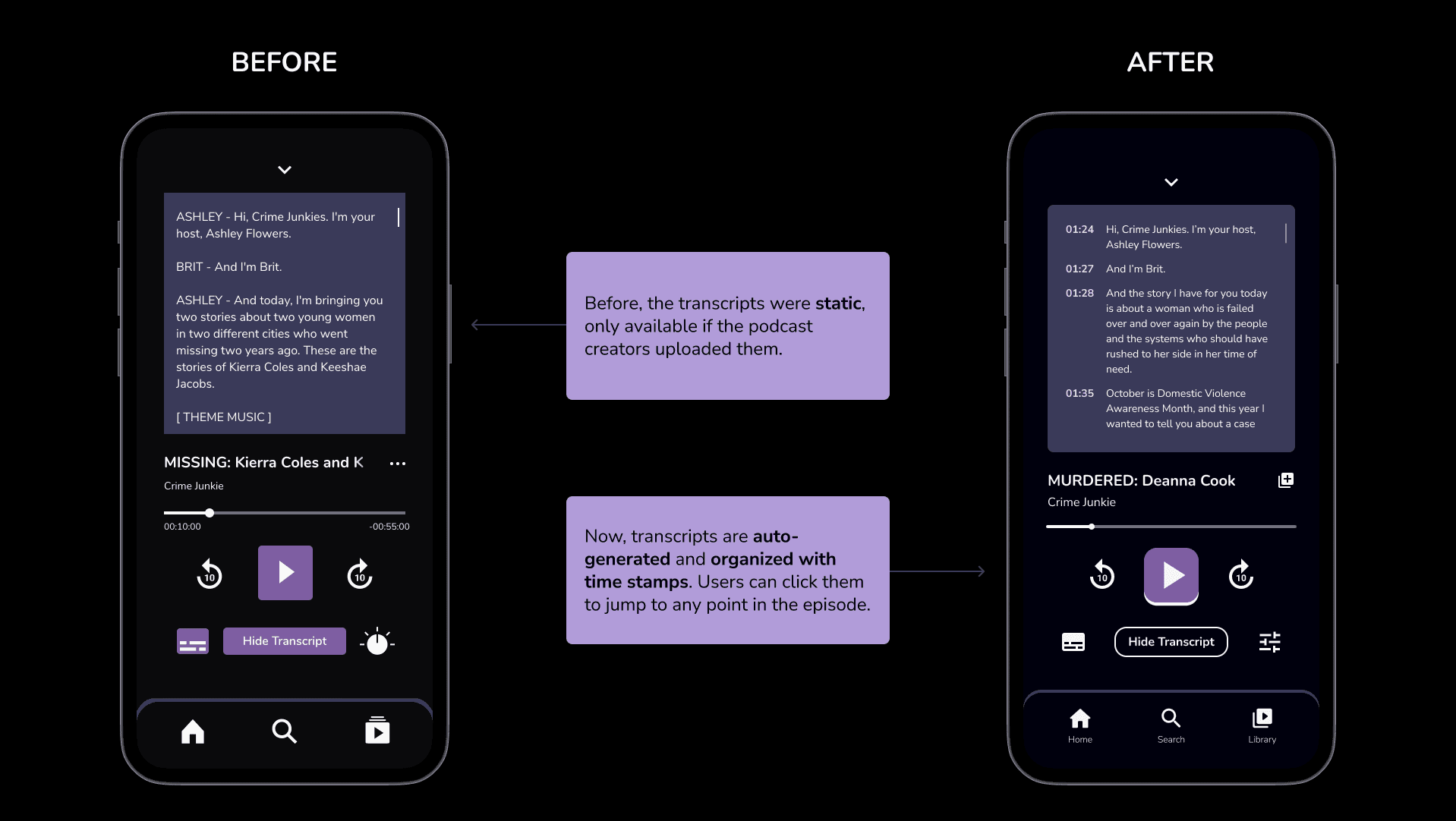
When I reviewed the original design, I identified a critical flaw: the app relied too much on creators to supply content for captions and transcripts. While I had initially explored this approach through the dedicated “Creators” pages in the original prototype, I realized that depending on the initiative of podcast creators would limit the platform’s scalability and effectiveness over time.
So, I pivoted away from that model entirely. Instead, I decided to rebuild WaveForm with autonomous capabilities powered by AI transcription, similar to established services like Otter.ai. In the real world, this would lead to more consistent accessibility regardless of creator interaction.
I then developed the basis for WaveForm's design system. This included standardizing the app’s foundational elements (typography, colors, and icons from Google’s Material Design library) and building reusable components (buttons, tabs, and sliders) to reduce irregularities in the updated design.

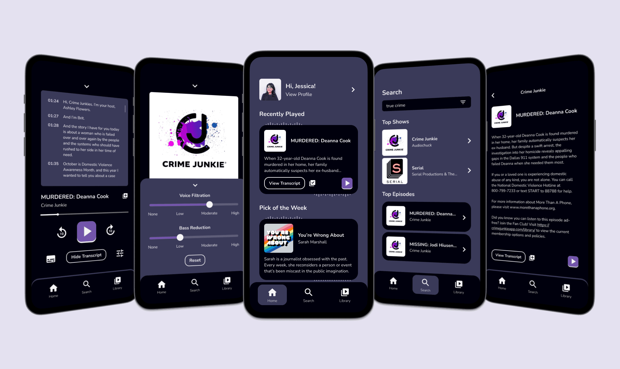
Final Design
A new-and-improved WaveForm.
With this redesign, I improved the core features that differentiate WaveForm from other podcast platforms out there, while refining the overall interface. Scroll to see before-and-after comparisons and to click through the prototype.

Takeaways
Revisiting WaveForm through this redesign was deeply rewarding.
This project remains a favorite of mine, and I’m glad I could revitalize it with a new perspective and improved design techniques.
Our collective understanding of accessibility is always evolving, and that needs to keep happening. As designers, we have a responsibility to explore new techniques and adapt old ones to create inclusive designs.
I also gained a greater appreciation for the value of design systems and component libraries. Establishing design patterns and layered components enhanced the consistency of my designs and streamlined my workflow, allowing me to dedicate more time to solving the problems at hand.